BIOL 1406

PreLab 2.8

How can I use graphs to analyze the relationship between 2 experimental variables?

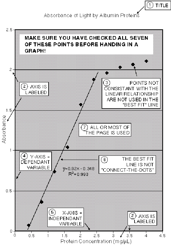
Graphs often make it easier to see relationships between the variables you are studying.  There are many types of graphs, but the one you will use most often in this class is a simple scatter diagram.  To make a scatter diagram, begin by drawing the axes for the graph on a sheet of graph paper.  The horizontal axis of the graph is called the x-axis or abscissa, and the vertical axis is called the y-axis or ordinate.  Each axis must be labeled with a description of the variable you are plotting (e.g. “Protein concentration” or “A280 values.”) You should always plot the independent variable on the x-axis and the dependent variable on the y-axis.  Each axis must also be labeled with appropriate numerical values AND units of measurement. 

Values on the x axis should increase as you move from left to right, and values on the y axis should increase as you move upwards.  The simplest scatter diagrams uses a linear scale for both the x and y axes.  With a linear scale, a given change in distance along the axis always represents the same change in value for the variable, no matter where on the axis the change occurs.  For example, if you are plotting protein concentration on the x-axis and one square represents a change of 100 μg/mL, then every other square must also represents a change of 100 μg/mL.  Similarly, if you are plotting A280 values on the y-axis and one square represents an increase of 10.000, then every other square must also represents a change of 10.000.  In other words, as you move along each axis the value of the variable must increase at a constant rate.  Note that the scale on one axis does not have to match the scale on the other axis.  However, both scales should be linear and should be adjusted so that your completed graph will nearly fill the entire page.  After both axes are completely labeled, simply plot the paired values on your graph paper.  Finally, include a clear, descriptive title above your graph.

Scatter plot showing the relationship between age of drivers and number of fatal accidents


Checklist for Preparing a Graph or Chart

  1. Each axis should be clearly labeled with a description of the variable you are plotting.  Make sure you plot the independent variable on the x-axis and the dependent variable on the y-axis.  Independent variables are variables that the experimenter controls during the experiment.  The dependant variable is the one the experimenter measures at the end of each trial.
  2. Each axis should also be clearly labeled with appropriate numerical values and appropriate units of measurement.
  3. Values on the x axis should increase as you move from left to right, and values on the y axis should increase as you move upwards.
  4. Both axes should have a linear scale, meaning that the same increments are consistently the same distance apart.  The size of the increments on one axis does not have to match the size of the increments on the other axis, but both scales must be linear.
  5. Mark off the numerical values on each axis so that you completed graph will nearly fill the entire page.
  6. Give your graph a brief title that explains the relationship you are graphing.


     For more detailed information on how to draw graphs, please see Appendix E


YOUR TURN
  1. Download the following MS Word graph paper file.
  2. Print the piece of graph paper.
  3. Use the grid to make a scatter diagram of the data in Table 2.1 below (Absorbance of UV light by protein solutions). Plot each point using a single dot or small circle. Make sure you follow ALL of the directions listed in the "Checklist for Preparing a Graph or Chart" above.

Table 2.1  Absorbance of UV light by protein solutions

IMPORTANT:  When displaying data in a table:

Protein Concentration (μg/mL)

A280

1. The table should be self explanatory.  In other words, the table should have a descriptive title and all parts of the table should be clearly labeled so that the reader knows exactly what every number or entry in the table represents.

2. All measurements listed in the table should include appropriate units.  (Note, however, that absorbance values are unusual in that they are one of the few measurements that lack units.)

0 0.000
10 0.045
20 0.098
40 0.195
80 0.373
160 0.711
320 1.398
640 1.833
1280 1.999

Check your answer.


Close this browser window to return to Blackboard and complete the practice quiz and assessment quiz.