By using the premade chart layouts, you have inserted a trendline on your chart. As was mentioned previously, the trendline is a statistical procedure that produces the best fit linear line to a set of data. You will notice that once the trendline is inserted, it does not connect the dots but draws the line that best fits the data.
Note that the line is linear and does not just "connect the dots" but is the "best fit" line for the data. The equation for the line is y = 0.1083x + 0.1018. Note: your values will be different. The R-squared value is a statistical measurement that measures how well the data fits this line. This value ranges between 1 and -1. The closer to either 1 (or -1), the better the data fits the data. In this case, the R-squared value is 0.9917, which is close to 1 and therefore we can conclude that this data is linear. We generally want the R-squared value to be larger than 0.9. If the R-squared is lower than this, your data is not linear and you should not use the trendline function. You can remove the trendline by right clicking on the trendline and selecting delete. You should not delete the trendline in this exercise, however.
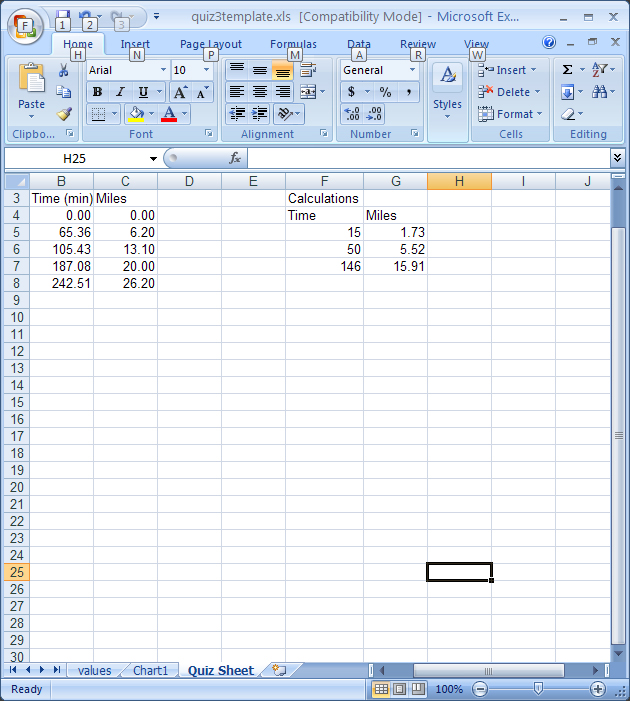
Now that you have the equation for the data, you can use this data to calculate where I should have been at 15 minutes, 50 minutes and 146 minutes. This is the power of trendline analysis, one can make a prediction from the data. Since we know the equation is y = 0.1083x + 0.1018 and we know that the X values are times and Y values are distances, we can simply insert one of the times (say the 15 min) and substitute for the X in the equation. This would be: y = (0.1083)(15) + 0.1018. Evaluate the equation and you will have the distance that I would have gone after 15 minutes ( I got 1.73 miles). To do this, simply go back to Quiz Sheet sheet and make an equation in cell G6 and "drag the box to copy the calculation. This was done below (note, you can see the equation in the formula box).
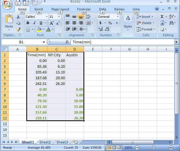
One last item, what if you want to plot two sets of data on a single chart. This is easy to do - you need to add the x values to the column containing your x variables and use a separate (third) column for the second sets of data. I later ran the Austin marathon and wanted to compare my times in the two races. I have added these times to the spreadsheet as shown in the following figure. The data from the second race is in green. Note: the x values must be in the same column for both sets of data and while both sets of data are kept apart, they both must be in ascending order. The y values are placed in a new column as shown. To make a chart with both, highlight all the data (as shown) and then follow the instructions given previously to make a new, second chart that includes both sets of data.
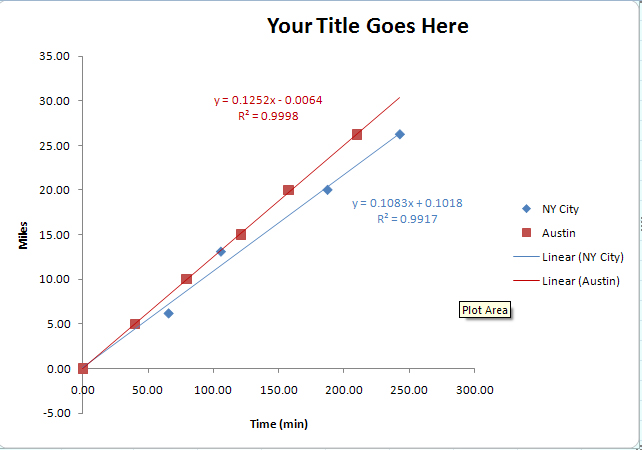
Your second chart should look something like the following. I have formatted the chart to make it easier to examine (using that powerful right click). In this instance, the slope of the line represents speed at which I ran in miles/min. In which race did I run faster (check the slope, the higher the slope, the faster was my speed).
Please do this and email me the file. Note, your numbers will NOT be the same as shown here.
Back a page
Return to Homepage