When you have completed all of the required items listed below, please save the spreadsheet file as initiallastnamequiz3.xls (my file would be called emeyertholenquiz3.xls) and email it to me before the due date.
Please do not wait until the last minute to do this assignment.
1. Download the file quiz3template.xls from here. Once you have saved the file, open it using Excel. Rename the file initiallastnamequiz3.xls.
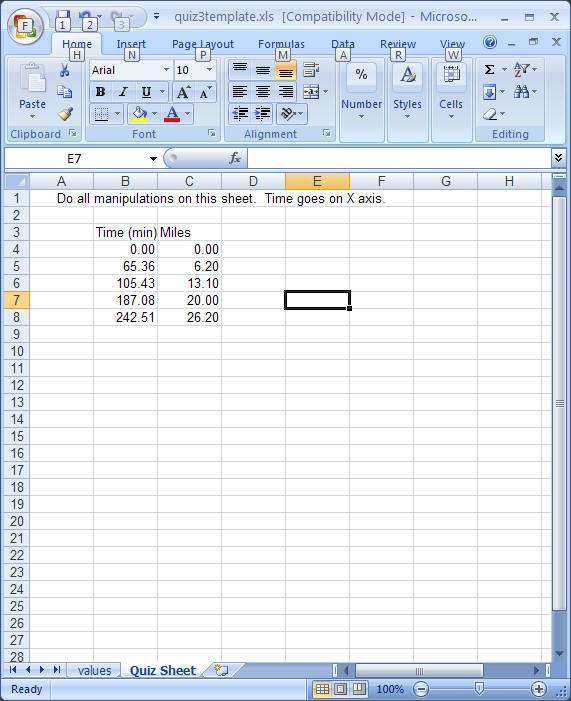
2. Open the file using Excel (of course). You will find that there are two worksheets in this file, one is name ‘values’ and the other is ‘Quiz Sheet". The ‘values’ sheet contains three columns of data under the label Time and Distance. This data represents my times when I ran the New York Marathon a few years ago. (If you were to examine one of the cells in any of the columns, you would find that these values are generated using a formula. Occasionally, you may find that the values in the columns may change for no apparent reason - this is normal and will not affect your ability to complete the exercises.)
3. Your first job is to copy data on the ‘values’ sheet and paste the values (NOT the formulas!!) to the ‘Quiz Sheet’. This requires the use of the Paste Special menu item in the edit menu. Format the values so that they contain only 2 places to the right of the decimal point. In some manner, please make sure that it is clear to the reader (me) what the values are. It is best if you were to add labels to your sheet to identify what your calculated numbers represent. Your sheet should look like the one below although you actual numbers will be different.
4. Prepare a chart (an XY also known as a scatter chart) of the data (DO NOT CONNECT THE DOTS). The data will (almost) fit on a straight line (which means that I ran at a consistent rate throughout the race). The graph will have a gray background and gridlines, please make the background white and remove gridlines. Be sure that there is a title and that there are labels on each axis. The following instructions will help you do this.
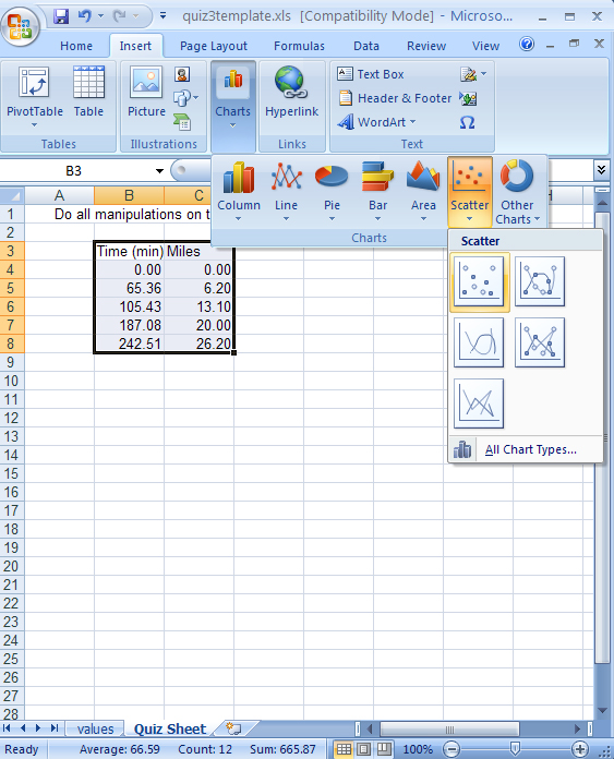
Select data to graph: Highlight the data you wish to graph, with the x axis values must be the first column (which they are). Note that the titles are highlighted as well. Remember that all cells with numerical values cannot also contain any letters (such as units).

Use the INSERT tab and choose CHARTS. You will a choice of chart types, select SCATTER (you will be tempted to select LINE, never do this for this class!!). You will then have an options of several Scatter plot styles - since we are going to do a trendline, choose the option that displays the data points but no lines. This is selected in the figure below. If you were not going to perform a trendline analysis, you should select the option with that displays both points and lines. For this exercise, however, select the option that displays only data points, as shown in the figure below.
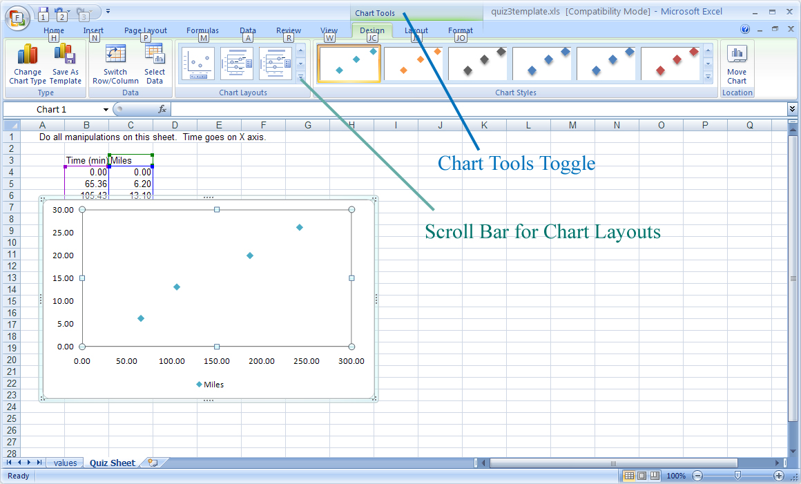
Your sheet should now look something like the following figure. Notice that while the chart is selected, the tabs across the top of the spreadsheet have several items that can affect how the chart is drawn, these are the Chart Tools. If they do not appear, there is a Toggle button at the top of the sheet, as indicated in the following figure. The chart layouts are a series of templates for formatting charts. For this exercise, we can use Layout 9. Use the scroll bar for chart layouts to scroll through the various layouts until you find Layout 9 (a label indicating the name of each layout pops up whenever the mouse rolls over the icon) and click on it.
Use the scroll bar for chart layouts to scroll through the various layouts until you find Layout 9 (a label indicating the name of each layout pops up whenever the mouse rolls over the icon) and click on it. This shown in the following figure.
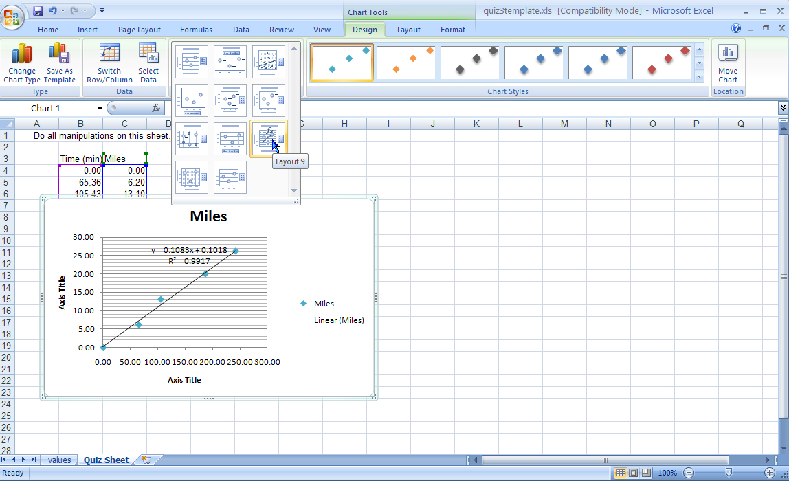
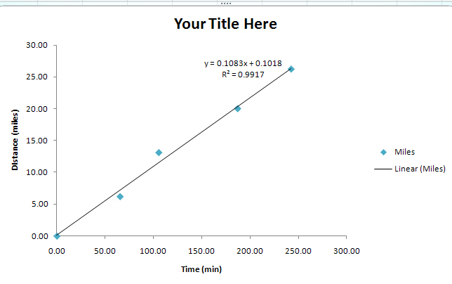
Layout 9 automatically sets up the graph and includes a statistical analysis known as a linear regression or, as Excel calls it, trendline. The trendline is a statistical procedure that produces the best fit linear line to a set of data. You will notice that once the trendline is inserted (the trendline is the black line now on the chart), it does not connect the dots but draws the line that best fits the data. This layout also insert the equation and the r-squared on the graph. Remember that the equation of a line is always in the form of y = mx + b. The trendline (or linear regression) will calculate the m (slope) and b (y-intercept). Before we examine the usefulness of the trendline analysis, let's first clean up the chart.
The chart needs a few changes, for example, we need to alter the chart title and the axes titles. This is done by using the right mouse button. Place the cursor over the X-axis title and right click. This will bring up a menu that deals with the X-axis title. Select edit text.
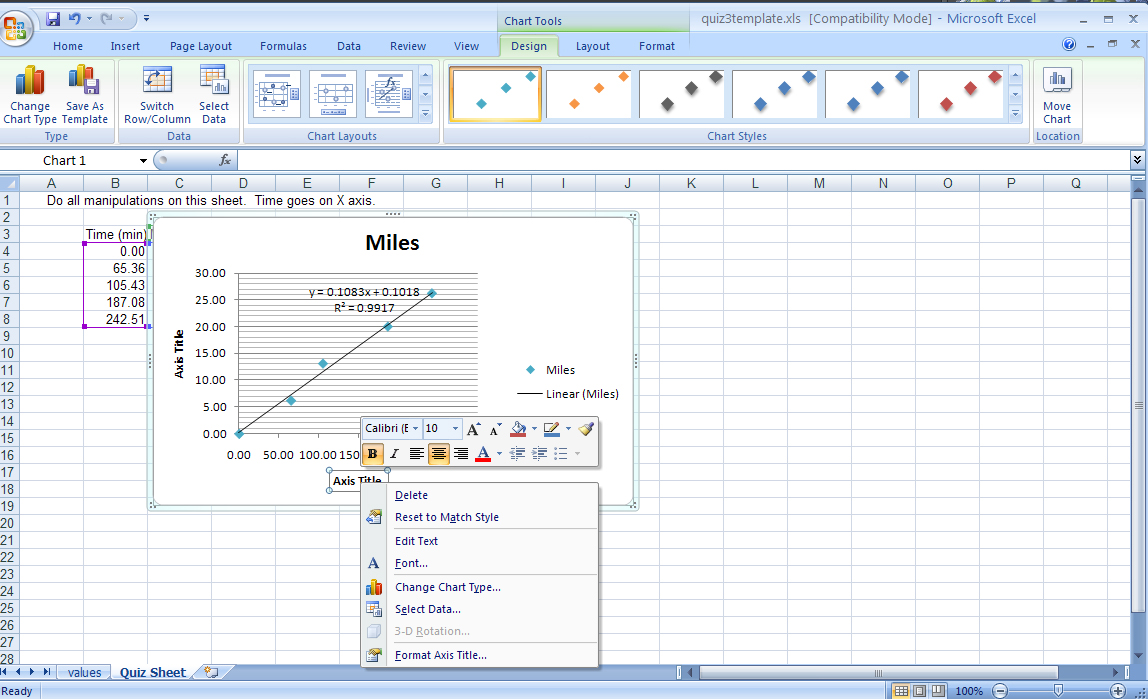
A cursor will now appear in the title, simple replace the current text with Time (min) as shown in the following figure. Do the same with the Y-axis (Distance (miles) and the main title (you can put anything that is appropriate).
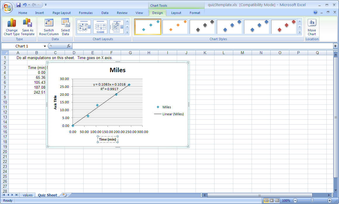
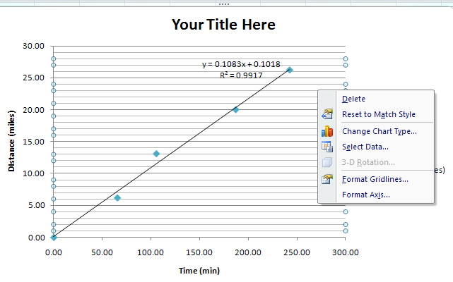
Now, let's get rid of those grid lines (your instructor may not find grid lines as abhorrent as I do). Nonetheless, if you wish to remove them, right click on the thinner lines (as shown below, right) and select DELETE. Do the same with the major grid lines and you should have a chart that looks like the left figure. One added point about using Excel, anytime you wish to alter something on the graph, you can right click on it to make a context specific menu occur. For example, you can change the axis scaling and formatting by right clicking on the numbers on an axis. This can be very helpful to remember.